Forecasting Volatility with Panel Regressions
Introduction
I have been forecasting volatility with simple rolling averages, and honestly, they work surprisingly well. I was pretty convinced that anything more sophisticated wouldn’t be worth the complexity.
Then a colleague challenged me. He’d been working on volatility forecasting for futures and found real improvements over rolling averages. It got me thinking: could the same be true for equities?
Here’s why this matters to me. I use volatility forecasts for position sizing: smaller positions in volatile stocks, larger positions in stable ones. Get it wrong and the errors compound directly into portfolio risk. Underestimate volatility and your positions run too large; overestimate and you leave returns on the table.
The thing is, simple rolling averages ignore structure that should be predictable. Volatility clusters, so high-vol days tend to follow high-vol days. It mean-reverts, so spikes decay back toward a long-run level. It responds asymmetrically to returns: down moves increase vol more than equivalent up moves (that’s the leverage effect). And it varies systematically by sector, with Utilities calmer than Energy. A model that captures this structure should, in theory, forecast better.
So this post tries to answer two questions I’ve been curious about: (1) Can we actually improve volatility forecasts with more sophisticated methods? (2) Do better forecasts translate to better portfolio performance?
To get a sense of the upper bound, I run a perfect-foresight experiment. Using Russell 1000 stocks from 1995-2024 (~7 million observations), perfect volatility knowledge on the long leg would lift the Sharpe ratio from 1.77 to 2.41, a 36% improvement. Obviously unattainable, but it tells me the ceiling is high enough to be worth chasing.
How I Use Volatility Forecasts
To give some context, this volatility forecast is part of a long-short equity strategy I run (see previous post on the low-volatility factor).
The allocation works in two stages. First, I use ML scores to select positions, say the top 50 or 75 stocks for the long leg (the exact number is somewhat arbitrary). Higher-scoring stocks get higher weights, lower-scoring stocks go to the short leg with the logic reversed. These initial weights $\alpha_i$ are normalized to sum to 1 per leg, and I cap individual positions so no single stock dominates. You could also just use equal weights here; the ML weighting isn’t the focus of this post.
Second, each position gets scaled by its predicted volatility:
\[w_i = \alpha_i \cdot \min\left(\frac{\sigma_{\text{target}}}{\hat{\sigma}_i}, \lambda_{\max}\right)\]where:
- \(\hat{\sigma}_i\) = volatility forecast for stock \(i\)
- \(\sigma_{\text{target}}\) = target volatility (20% annualized)
- \(\lambda_{\max} = 3\) = leverage cap
Note that while the initial weights \(\alpha_i\) sum to 1, the final weights \(w_i\) do not. They’re capped at 1, but in high-volatility environments (when most stocks have \(\hat{\sigma}_i > \sigma_{\text{target}}\)) the total exposure shrinks below 1. The portfolio naturally de-levers when volatility is elevated.
I also enforce a 5% max per stock. Currently, I estimate volatility with simple moving averages: 20-day rolling vol for longs, 60-day for shorts.
The Perfect Foresight Experiment
Before diving into models, I wanted to know: how much could better volatility forecasts actually help? To find out, I run a backtest where I cheat, using the actual realized volatility that we’d only know in hindsight.
I test three scenarios:
- Current: 20-day rolling vol for longs, 60-day for shorts (my production baseline)
- Perfect Long: Perfect foresight on the long leg only
- Perfect: Perfect foresight on both legs
Here’s something that might seem counterintuitive: Perfect Long actually outperforms Perfect (both). Why? Think about how a long-short portfolio works. Your combined return is long leg minus short leg. You’re subtracting the short leg’s return, so you actually want the short leg to do poorly.
When you give the short leg better volatility forecasts, it performs better: positions are sized more accurately, it captures more return. But that “improvement” is now being subtracted from your total. In the results below, the short leg return jumps from 0.07% to 2.77% with perfect foresight. That’s 2.7% you’re now losing on the combined portfolio. The long leg is where better forecasts genuinely help you.
Results
Here’s what the equity curves look like:
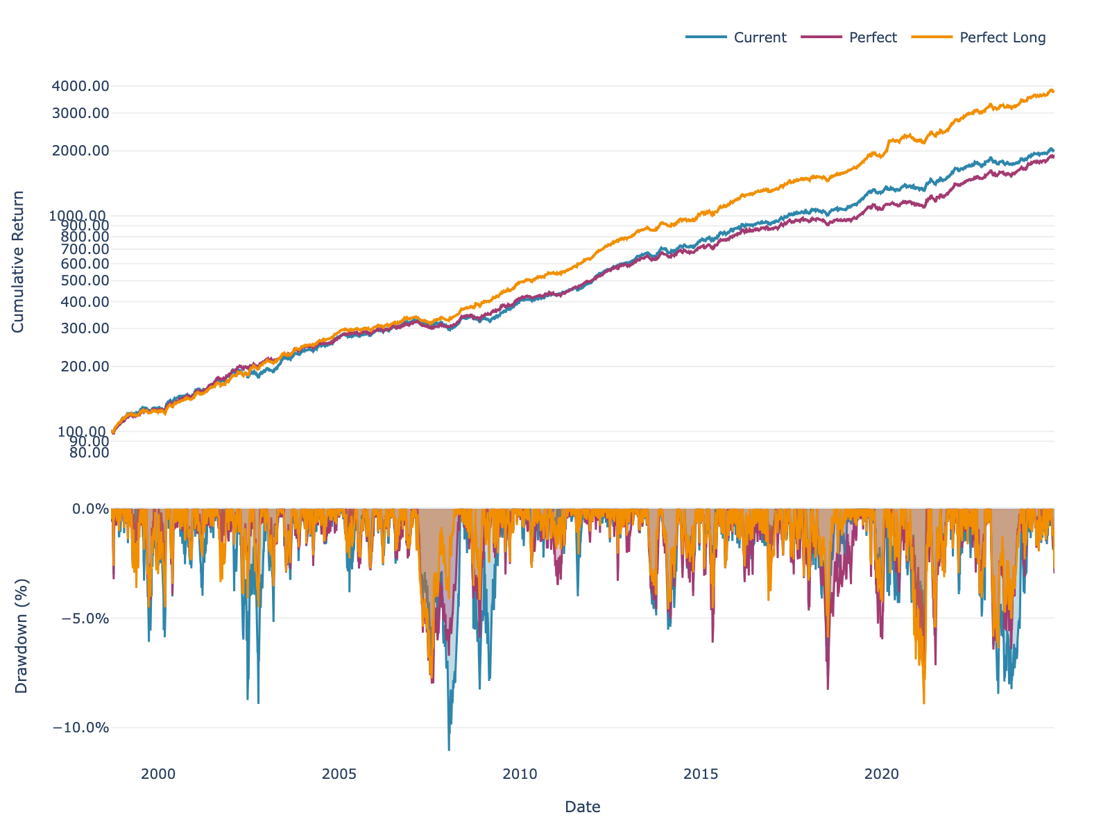
Figure 1: Long-short portfolio performance with different volatility estimation methods.
And breaking it down by leg:
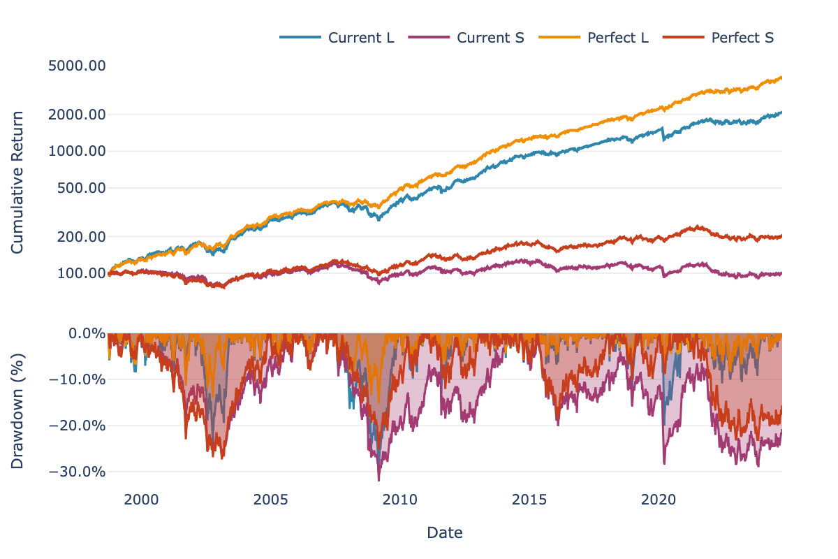
Figure 2: Long and short legs separately. Where does the improvement come from?
Performance Breakdown
Let’s look at the actual performance. First, the combined long-short portfolio:
| Scenario | Return | Sharpe | Max DD |
|---|---|---|---|
| Current | 12.15% | 1.77 | -11.06% |
| Perfect Long | 14.91% | 2.41 | -8.93% |
| Perfect | 11.86% | 1.90 | -8.27% |
Table 1: Long-short portfolio performance (with fees). Perfect Long = perfect foresight on long leg only.
The numbers confirm what I mentioned earlier: Perfect Long beats Perfect. You can see the short leg effect at work. When the short leg “improves,” that return gets subtracted from your total.
Here’s the leg-by-leg breakdown:
| Current | Perfect Foresight | |||||
|---|---|---|---|---|---|---|
| Return | Sharpe | Max DD | Return | Sharpe | Max DD | |
| Long | 12.34% | 1.19 | -30.11% | 15.24% | 1.76 | -15.14% |
| Short | 0.07% | 0.01 | -32.09% | 2.77% | 0.30 | -27.34% |
Table 2: Individual leg performance with Current vs Perfect volatility forecasts.
The long leg is where the magic happens: about 3% more return, the Sharpe nearly doubles from 1.19 to 1.76, and drawdowns get cut in half. The short leg improves too, but it runs at lower leverage so the effect is smaller. And as I mentioned, that improvement actually hurts you on the combined portfolio.
What This Tells Us
So perfect foresight on the long leg would take the Sharpe from 1.77 to 2.41, a 36% improvement. Obviously we can’t achieve perfect foresight, but this tells me the ceiling is high enough to justify spending time on better forecasting methods.
The rest of this post explores whether I can get any closer to that ceiling. I compare simple baselines, per-asset regressions, and global pooled models to see what works.
Data & Exploration
Data
I use historical point-in-time data for Russell 1000 constituents from 1995 to 2024. This gives me roughly 7 million date × asset observations, with about 1,000 stocks in the universe at any point in time.
Importantly, the dataset includes stocks that later went bankrupt or got delisted. Using point-in-time constituent lists avoids survivorship bias, so I’m seeing the universe as it actually looked back then.
Data Exploration
Before diving into features, it’s worth looking at what we’re actually trying to predict. Figure 3 shows the distribution of 21-day realized volatility across sectors.
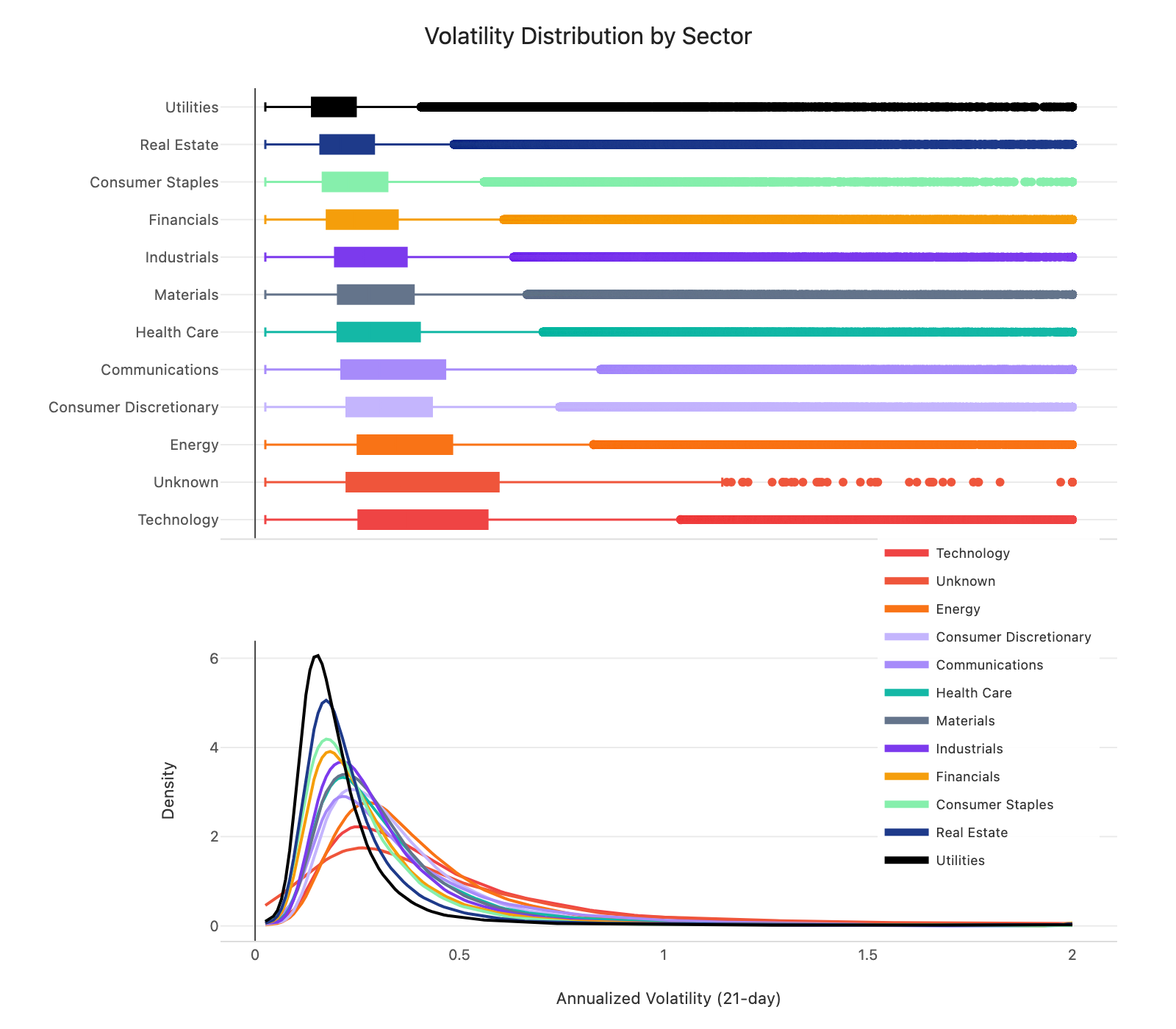
Figure 3: Distribution of 21-day realized volatility by sector (box plots + density curves).
A couple of things stand out. First, the shape of the distributions is similar across sectors, but the levels differ. Median vol ranges from about 15% for Utilities to 30% for Energy, a 2x spread. This suggests sector dummies could capture these level differences while the model learns shared dynamics.
Second, all sectors show the same right-skewed pattern. Most observations sit in the 10-25% range, but there’s a long tail stretching past 100%. Predicting in log-space could help here, since it compresses the tail and makes the target more symmetric.
With that context, let me walk through the features I use.
Feature Engineering
For each stock, I compute:
Rolling volatility at multiple horizons (5, 21, 63, 126 days) to capture volatility clustering:
\[\hat{\sigma}_{i,t}^{(w)} = \sqrt{\frac{252}{w} \sum_{k=0}^{w-1} r_{i,t-k}^2}\]Upside and downside volatility over 21 days to capture the leverage effect:
\[\hat{\sigma}_{i,t}^{\text{down}} = \sqrt{\frac{252}{21} \sum_{k=0}^{20} r_{i,t-k}^2 \cdot \mathbf{1}_{r_{i,t-k} < 0}}\] \[\hat{\sigma}_{i,t}^{\text{up}} = \sqrt{\frac{252}{21} \sum_{k=0}^{20} r_{i,t-k}^2 \cdot \mathbf{1}_{r_{i,t-k} \geq 0}}\]Sector dummies to capture sector-level differences in volatility.
Log market cap to capture the size effect.
For preprocessing, I clip features and target to [2.5%, 200%] to limit outlier impact, and create log-transformed versions to test whether log-space modeling helps.
Methodology
With features in place, the next question is how to estimate the model. The target is 21-day realized volatility (annualized). I filter to Russell 1000 constituents, drop rows with >75% missing features, and impute the rest using sector means.
I use a simple walk-forward setup. For each date, I fit on the past 504 days (2 years) and predict on today. For global models, I refit every 25 days to keep computation time and memory manageable.
I use Ridge regression rather than OLS because the volatility features are highly correlated (~0.8+), which makes OLS coefficients unstable. Ridge adds an L2 penalty that keeps things well-behaved. I set \(\alpha = 1\) and tested other values; the conclusions don’t really change.
Implementation with polars-ols
For the actual computation, I use polars-ols, a Rust-based linear regression plugin for Polars. It’s incredibly fast: on my laptop (no GPU), the per-asset rolling regressions over 7 million observations take around 40 seconds, and the global panel model around 2 minutes. For this kind of workload, that’s remarkable. Highly recommend it.
Here’s a toy example showing both per-asset and global models. First, define your features once:
import polars as pl

FEATURES = [
    pl.col("vol_5"), pl.col("vol_21"), pl.col("vol_63"),
    pl.col("vol_126"), pl.col("log_mktcap")
]
For per-asset models, use rolling_ols with .over("asset_id"):
df = df.with_columns(
    pl.col("target")
    .least_squares.rolling_ols(
        *FEATURES,
        window_size=504, alpha=1.0, add_intercept=True
    )
    .over("asset_id", order_by="date")
    .alias("coefficients")
)
For global/panel models where you pool across assets, use group_by_dynamic:
# Build regression expression
reg_expr = pl.col("target").least_squares.ridge(
    *FEATURES, alpha=1.0, add_intercept=True
)

# Rolling coefficients, refit every 25 days
df_coef = (
    df.sort("time_idx")
    .group_by_dynamic("time_idx", every="25i", period="504i")
    .agg(reg_expr.alias("coefficients"))
)

# Join back and predict
df = df.join(df_coef, on="time_idx", how="left")
df = df.with_columns(
    pl.col("coefficients")
    .forward_fill()
    .shift(25)  # out-of-sample
    .least_squares.predict(*FEATURES)
    .alias("prediction")
)
The .shift(25) ensures predictions are out-of-sample.
Results
This is the part I was most curious about: do any of these methods actually improve forecasts? I’ll start with simple baselines and then move up the complexity ladder.
Baselines
I start with the simple approaches I’d reach for if I wanted something fast and robust: rolling volatility at different horizons, plus some combinations.
| Model | Correlation | RMSE |
|---|---|---|
| Simple vol-5 | 0.591 | 0.235 |
| Simple vol-21 | 0.672 | 0.199 |
| Simple vol-63 | 0.689 | 0.190 |
| Composite average | 0.697 | 0.189 |
| Weighted blend | 0.676 | 0.184 |
Table 3: Baseline forecast performance.
The 21-day and 63-day measures are what I currently use in production (20-day for longs, 60-day for shorts, which are close to these horizons), so they’re the benchmarks to beat. Longer horizons tend to do better (63-day hits 0.69 vs 0.59 for 5-day), which makes sense since they smooth out noise. The composite average, which equally weights 5, 21, and 63-day vol, achieves the highest correlation (0.697). The weighted blend has slightly lower RMSE (0.184 vs 0.189) but lower correlation (0.676), so I use correlation as the primary metric since it better captures directional accuracy for position sizing.
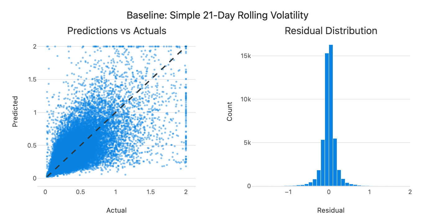
Figure 4: Predicted vs actual volatility for the weighted blend baseline.
Predictions follow the diagonal but with significant scatter. Can we do better by learning the weights from data?
Per-Asset vs Pooled Models
My first attempt was to fit a separate model for each stock, estimating coefficients on its own 2-year history.
| Model | Correlation | RMSE |
|---|---|---|
| Composite average (baseline) | 0.697 | 0.189 |
| Per-asset regression | 0.661 | 0.191 |
Table 4: Per-asset regression vs baseline.
The per-asset regression actually underperforms the simple composite baseline. This is the bias-variance tradeoff at work. Per-asset models have low bias: they fit each stock’s own history well. But with only ~500 observations per stock, they have higher variance: the coefficients are noisier, which can hurt out-of-sample performance.
Pooling across assets flips this tradeoff:
| Model | Correlation | RMSE |
|---|---|---|
| Per-asset regression | 0.661 | 0.191 |
| Per-sector pooling | 0.715 | 0.178 |
| Global pooling | 0.715 | 0.178 |
| Global + sector dummies | 0.714 | 0.178 |
Table 5: Impact of pooling across stocks.
Global models have slightly higher bias (they assume all stocks share the same dynamics), but much lower variance (millions of observations to estimate a handful of coefficients). The variance reduction dominates. Correlations jump from 0.66 to 0.715.
Interestingly, per-sector and global pooling perform almost identically. Even sector-level dynamics don’t seem different enough to justify separate estimation. Volatility behavior appears largely universal.
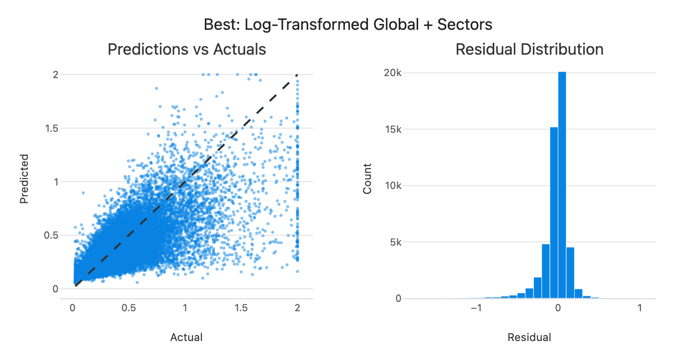
Figure 5: Predicted vs actual volatility for the global pooled model.
Predictions cluster closer to the diagonal, but there’s still a pattern: the model tends to underpredict when actual volatility is high. Linear models trained on mostly normal observations tend to undershoot extremes. This might be exactly when accurate forecasts matter most for position sizing, though that’s worth testing explicitly.
Log-Space and Macro Factors
Since the target is right-skewed, I tested log-transforming both features and target.
| Model | Correlation | RMSE |
|---|---|---|
| Global + sector dummies | 0.714 | 0.178 |
| Global + log dummies | 0.720 | 0.178 |
| + market vol factor | 0.716 | 0.179 |
| + group risk factor | 0.722 | 0.178 |
Table 6: Log-space and macro factor variants.
Log-space gives a small but consistent edge (0.714 → 0.720). I also tried adding market-level volatility factors, but they contribute only marginally. The group risk factor (sector-level vol relative to its long-run average) adds a tiny improvement. For simplicity, I stick with log-space + sector dummies.
Summary
Here’s the full progression:
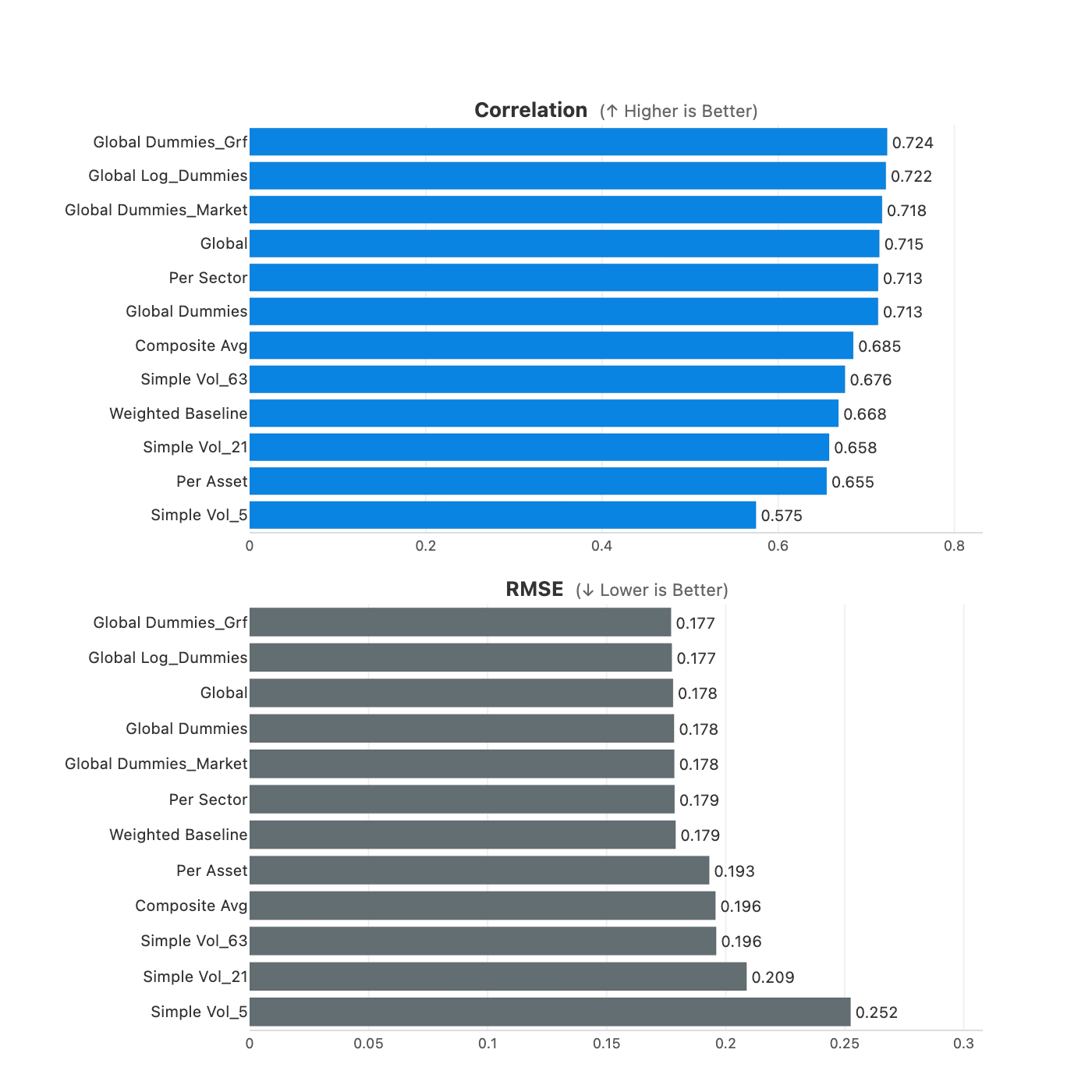
Figure 6: Comparison of all model variants (correlation and RMSE).
The pattern is clear: fitting a model per asset underperforms because the coefficients are noisier. Pooling across assets is where the gains come from (0.66 → 0.72). Log-space adds a small edge on top, macro factors barely move the needle.
Note: The next step is to test whether these forecast improvements (correlation 0.66 → 0.72) actually translate to better portfolio performance in the backtest. That analysis is on my todo list and will show whether the gains carry through to Sharpe, returns, and drawdowns.
Robustness Checks
Before settling on a final model, I wanted to sanity-check how sensitive these results are to my choices.
On window size: I swept from 1 year to 10 years. Longer windows help slightly (correlation rises from 0.712 to 0.728), but I stick with 504 days mainly to keep things simple and fast.
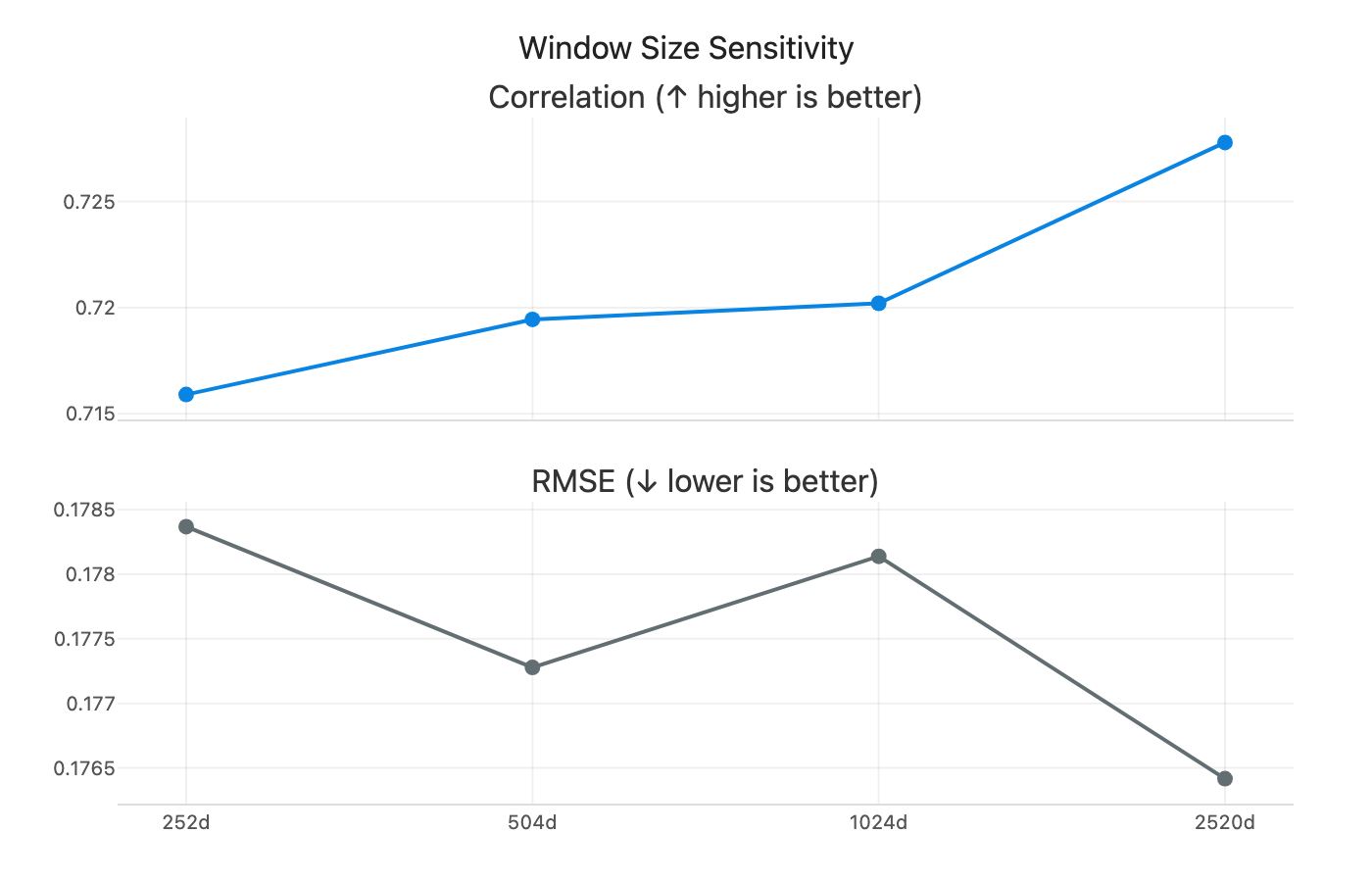
Figure 7: Model performance across different rolling window sizes (252 to 2520 days).
On update frequency: I tested how often to refit the global model, from daily to every 100 days. More frequent updates help slightly, but the gains are modest. Refitting every 25 days strikes a good balance between performance and computational cost.
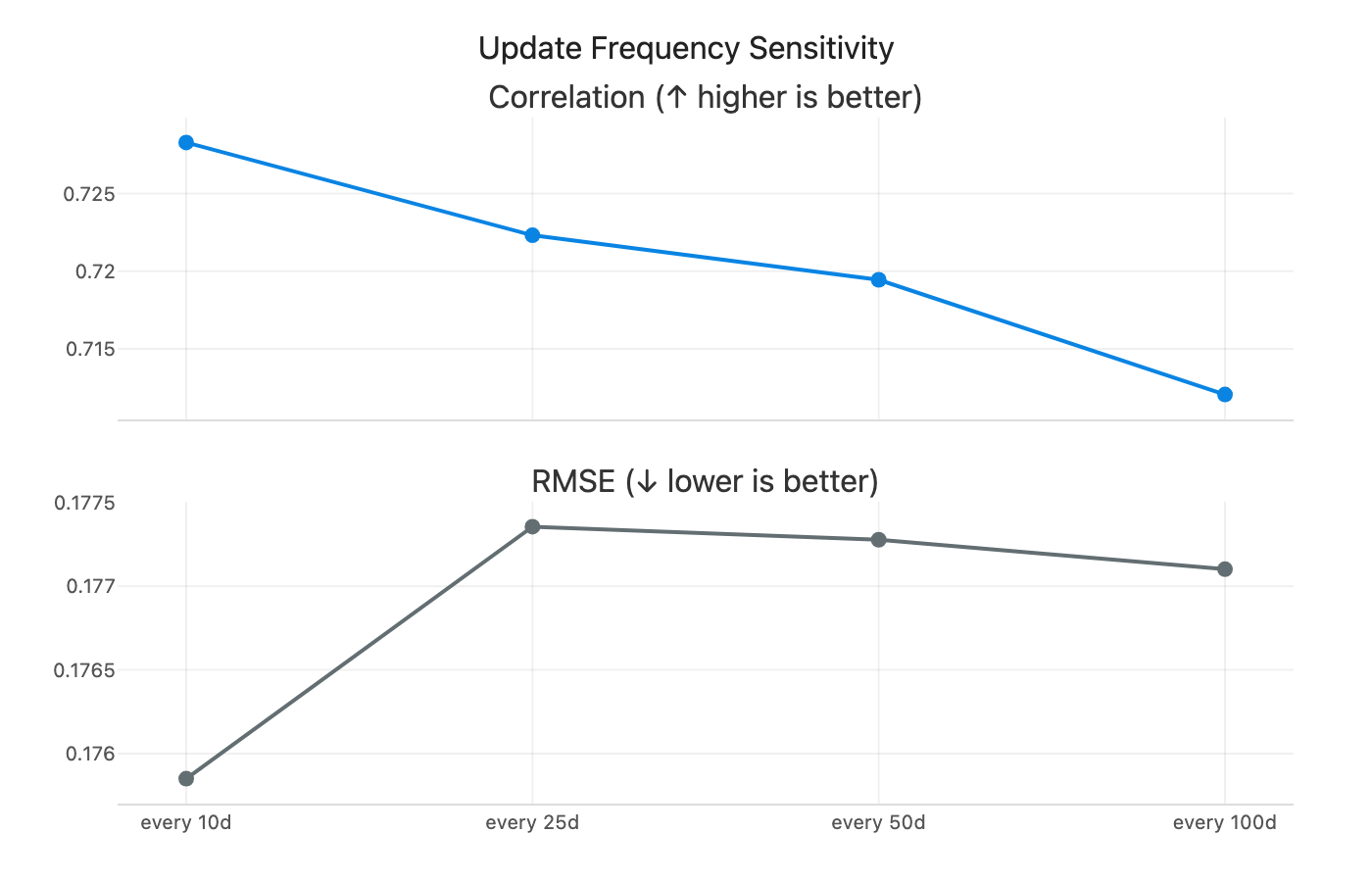
Figure 8: Model performance across different refit frequencies (1 to 100 days).
On regime robustness: the pattern is clearer once you look at the chart. In low and neutral regimes, the pooled models (global + dummies / log variants) sit at the top. In high-vol regimes, the simple baselines actually lead, with the composite average and weighted blend at the top. So complexity helps most in calm markets, but the simple rules win when vol is already elevated.
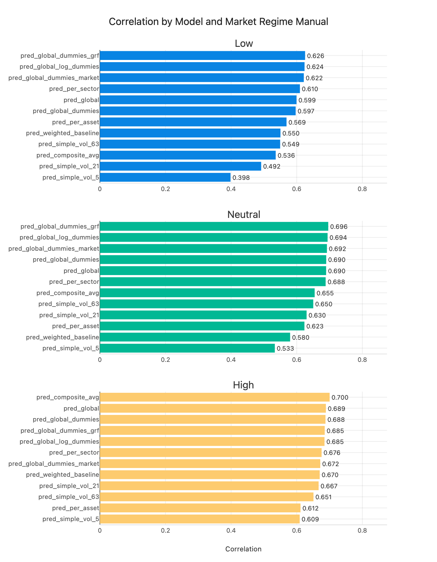
Figure 9: Correlation by market volatility regime: low (<20%), neutral (20-30%), high (>30%).
What the Coefficients Tell Us
One nice thing about linear models is you can actually see what they’re doing. The heatmap below shows how the coefficients evolve over time:
Figure 10: Rolling regression coefficients over time. Red = predicts higher vol, blue = predicts lower vol.
Here’s what I see. These coefficients are in log space, so interpret them as elasticities rather than level effects.
Most volatility features are positive: 5-day, 63-day, 126-day, and both upside and downside volatility are orange. The only consistently negative ones are the 21-day measures (regular 21-day vol and EWM 21-day vol), which show up as blue. My reading is that the model leans on very short-term and longer-term vol, while the 21-day horizon acts as a correction once those are included.
Both downside and upside volatility are positive, with downside a bit stronger. That lines up with the intuition that negative moves carry more information about future risk, but upside still matters.
Market cap is close to white but slightly negative, which is a mild size effect rather than a dominant signal.
Sector dummies are mostly blue (negative) with occasional positive spikes. Utilities are consistently negative, which fits the safe-haven intuition. Tech spikes around 2000 (dot-com). Energy turns light red from roughly 2015 through 2022. There’s also a strong positive spike in the “unknown” category, which likely captures firms that later went bankrupt or were delisted. Most of the time sector effects are small, but they light up during specific regimes.
Conclusion
If I had to sum it up: pooling beats per-asset models, log-space adds a small edge, and the simple baselines still hold up, especially when volatility is high. It’s a good reminder that more complexity doesn’t always help.
For now, the model I’d actually use is a global Ridge regression in log space with sector dummies and a 2-year rolling window. It’s stable, fast, and close to the best forecasting performance I can get from these features.
The bigger takeaway is about structure. Volatility dynamics look remarkably shared across assets, which is why pooling helps so much. That lines up with How Global is Predictability? and AQR’s Risk Everywhere.
What’s Next
The next step is to plug these forecasts into the position-sizing pipeline and see what they do for actual portfolio performance. That’s the real test.
If the improvements don’t carry through, then the path forward is probably richer features rather than just tweaking the same linear setup. There are lots of obvious directions: more windows, price and technical features, skewness and higher moments, or other market-state variables. I kept it intentionally simple this time. Event timing (like days to earnings) and regime indicators feel like the most promising additions. Non-linear models might help too, but only if the features actually contain the signal.
References
- How Global is Predictability? The Power of Financial Transfer Learning - O. Hellum, L.H. Pedersen, A. Rønn-Nielsen
- Risk Everywhere: Modeling and Managing Volatility - T. Bollerslev, B. Hood, J. Huss, L.H. Pedersen